Web Development

Сообщение об ошибке

  • Notice: Trying to access array offset on value of type int в функции element_children() (строка 6595 в файле /home/u1000/domains/bighameleon.com/includes/common.inc).
  • Notice: Trying to access array offset on value of type int в функции element_children() (строка 6595 в файле /home/u1000/domains/bighameleon.com/includes/common.inc).
  • Notice: Trying to access array offset on value of type int в функции element_children() (строка 6595 в файле /home/u1000/domains/bighameleon.com/includes/common.inc).
  • Deprecated function: implode(): Passing glue string after array is deprecated. Swap the parameters в функции drupal_get_feeds() (строка 394 в файле /home/u1000/domains/bighameleon.com/includes/common.inc).
Аватар пользователя Натали

Facet API Bonus / Фасет АПИ Бонус / Про примочки к фасетам на русском (описание на русском) / Фасетный поиск на нефасетных страyицах / Facet search on non facet pages / Show the last level of facet hierarchy / Показать последний уровень фасетной иерархии

Раздел: 

Facet API Bonus для Drupal 7 - это коллекция дополнительных Facet API плагинов и функциональных возможностей, прежде всего фильтра и плагинов зависимостей - и место для хранения большинства дополнительных расширений Facet API.

В настоящее время Facet API Bonus включает в себя:

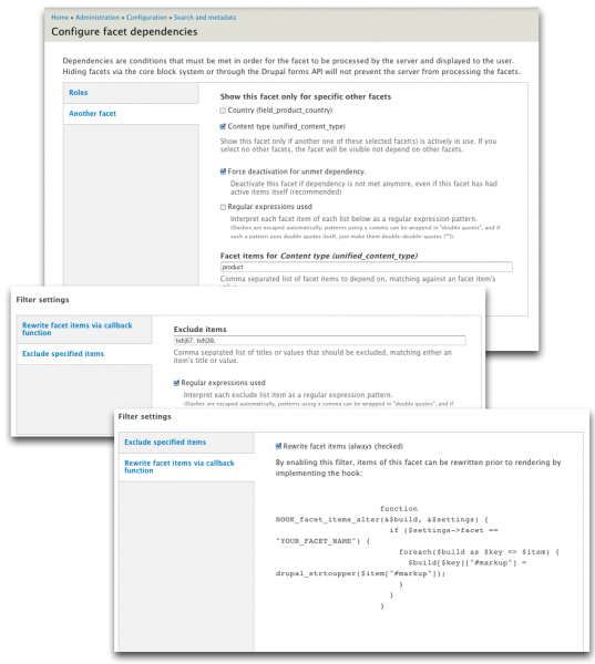
Facet Dependency (Facet-ные Зависимости): плагин зависимостей, чтобы сделать один фасет (например "категория продукта"), чтобы показать в зависимости от других фасетов или специфических фасетных активных пунктов (item-ов) (например, "тип содержимого" - это "продукт" или "сервис"). Очень гибкий, поддерживает  мультифасеты, для зависимостей, а также регулярное выражение для определения зависимостей фасетного пункта (item-а) , так же как и параметр, как себя вести, если зависимость теряется.

"Exclude Items (Исключить позиции/айтемы)": Плагин для фильтра , для исключения определенных фасетных айтемов по их разметке / названию или внутреннему значению (например, за исключением "page-ей" с "типов содержимого»). Также возможны регулярные выражения.

(Продолжение следует...)


Как показать фасетный поиск на нефасетных страницах

Бывают случаи, когда на сайте при разработке необходимо вывести поисковые фасеты на нефасетных страницах. Например, Вы хотите, чтобы самые популярные категории отображались на главной странице, вместе с соответствующими счетчиками. Когда посетитель сайта нажимает на какую-либо категорию, его должно перенаправить на поиск по сайту, с нажатой категорией, выбранной в фасетах. 

Чтобы все это сделать, есть блочный дисплей Views Facets, предусмотренный подмодулем search_api_facetapi

С его помощью можно легко использовать фасетные ссылки для любого поиска на любой желаемой Вами странице. С этой целью есть две опции:

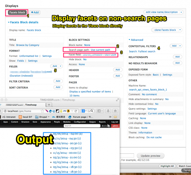
Показать фасеты непосредственно в блоке вьюса

Необходимо или создать новый вьюс на основе поискового индекса, который вы хотите использовать, или изменить старый вьюс. Добавьте тип отображения "Facets block" (Фасетный блок) для просмотра и настройки "Facet field" (фасетного поля) и "Search page path" (Пути страницы поиска) в "Настройке блока".

Фасеты не будут выведены в предварительном просмотре, поэтому, чтобы проверить ваш вьюс, включите Ваш новый вьюсовый фасетный блок, зайдя Администрирование> Структура> Блоки, как вы обычно делаете для всех других блоков. Настройте блок, чтобы он отображался на тех страницах, на которых Вам необходимо его вывести.

Настройте любые (контекстные) фильтры, которые нужно применить к результату, который используется для фасетных ссылок (например, учитывать только категории для опубликованных нод определенного типа контента). Exposed фильтры игнорируются. Настройки формата и полей игнорируются, но вы также можете изменить настройки нажав на "Прочее".

Список фасетных ссылок будет выведен на страницах, которые были указаны.

Однако существуют некоторые ограничения в этом варианте:

Фасетные ссылки всегда будет оформлены в виде списка, невозможно будет переписать или отформатировать выбранное.
В частности, также невозможно использовать обычные Facet API виджеты для этих фасетов. Это потому, что достаточно сложно добиться повторного использования Facet API компонентов снаружи Facet API .
Если вы хотите отобразить фасеты для более чем одного поля, вы должны добавить дополнительные _вюсовые диспели для фасетного блока и каждый будет выполнять отдельный поисковый запрос при отображении.

Чтобы разрешить эти недостатки, существует второй вариант:

Вы также можете просто использовать дисплей фасетного блока, чтобы выполнить поиск, а затем использовать обычное Facet API для фасетных блоков чтобы вывести в них фасеты. Чтобы сделать это, создайте дисплей фасетного блока, как и раньше, но установите настройку "Скрыть блок" в настройках блока. Таким образом, на страницах, на которых появится блок, поисковый запрос выполняется, но блок будет скрыт.

Теперь вы можете создать фасетные блоки для этого поиска как обычно, на  индексной станице на вкладке "Фасеты". Вы просто должны убедиться в том, что фасет активен для дисплея фасетного блока (обычно ID будет равен search_api_views: [VIEWS_ID] -facets_block) в "Display for searches" / "Search IDs . Затем, все обычные опции Facet API могут быть использованы для определения вида и поведения отображаемых фасетных блоков. Фасеты в этих блоках будут автоматически использовать путь, выданный во вьюсовых фасетных блоках в настройках "Путей поисковой страницы".

Тем не менее, есть также некоторые проблемы с этим подходом: Во-первых, в настоящее время не представляется возможным вывести тот же фасет в двух разных местах (# 1411160: Разрешить фасетуотображаться несколько раз в той же сфере). Таким образом, список фасетов на главной странице должен быть в той же области и месте, для поиска и быть отстилизирован так же. Обход этого  по любому (или путем клонирования фасетного блока, или путем альтера (изменения) дисплея для перемещения блока) в настоящее время по-прежнему требуется кодинг (если вы не используете панели (или что-то аналогичное) для отображения блоков).

Вторая проблема  - это то же самое, что описано в Часто задаваемых вопросах (Search API FAQs) - для того, чтобы фасетные блоки работали, вы должны убедиться, что вьюс выполняется перед тем, как блоками рендерятся. Однако, поскольку вы можете положить вьюсовый блок в любом регионе, (поскольку он любом случае не будет отображаться ), это не должно быть слишком большой проблемой, чтобы найти положение, при котором это требование считается выполненным.

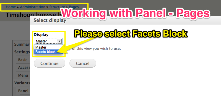
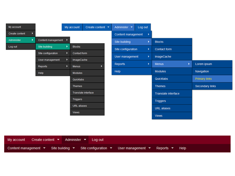
Добавление фасетного блока в панель


Почему все, что выше описано про фасеты, фасетный поиск и про фасетные блоки может не работать?

Оказывается, что когда скрываются фасетные блоки и размещаются в том же регионе, они должны еще и быть расположены выше, чем выводятся в том же регионе фасетные фильтры. Если блоки находятся ниже, то ничего не работает. Как только фасетные блоки перемещаешь выше фильтров и скрываешь, фасетные фильтры начинают выводиться на всех страницах.


Показать последний уровень иерархической таксономии в мультифасетах

Полезная функция автоматически разделит иерархический словарь, после чего  каждый уровень получит свой собственный фасетный блок и пользовательскую метку. Кажется, этот модуль уже имеет опцию для переписывания одиночного фасета. Поэтому, мы уже на полпути. Как трудно было бы сгенерировать фасетный блок для каждого уровня?

Эта опция будет особенно удобна для товарных категориях, где термины могут иметь несколько родителей, например,  "размер" или "цвет". Если они отображаются в отдельных блоках, для пользователя гораздо более ясно , как перемещаться по фасетам вместо навигации по огромному фасетному дереву , где термины отображаются несколько раз ...

Xитать полезную информацию про все это вот тут

https://www.drupal.org/node/1493326

и патч скачать для модуля Фасет АПИ Бонус вот тут https://www.drupal.org/node/2056099


Переводы сделаны на основе следубщих страниц:

https://www.drupal.org/node/2017007

Аватар пользователя Натали

Правильный интерфейс для пользователей

Раздел: 

Добрый день, наши уважаемые клиенты, разработчики и просто читатели. Предлагаем для прочтения очень полезную статью. К сожалению она на английском, чуть позже переведем ее на русский для тех, кто не все поймет на английском.


  1.  A one column layout will give you more control over your narrative. It should be able to guide your readers in a more predictable way from top to bottom. Whereas a multi column approach runs some additional risk of being distracting to the core purpose of a page. Guide people with a story and a prominent call to action at the end.
  2. Try Giving a Gift instead of closing a sale right away.
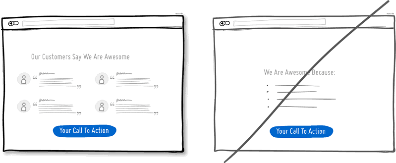
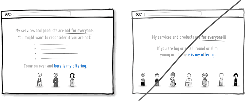
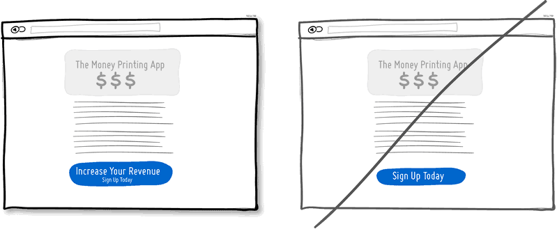
     A friendly gesture such as providing a customer with a gift can be just that. Deeper underneath however, gifting is also an effective persuasion tactic that is based on the rule of reciprocity. As obvious as it sounds, being nice to someone by offering a small token of appreciation can come back in your favour down the road.
  3. Try Merging Similar Functions instead of fragmenting the UI.
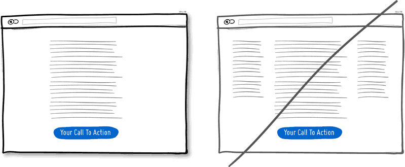
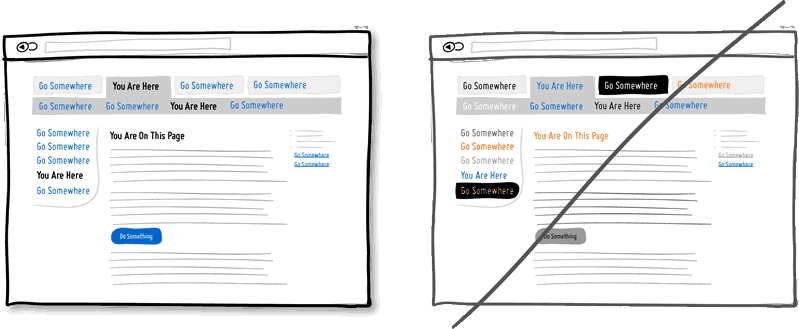
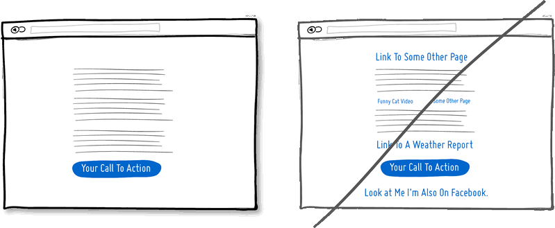
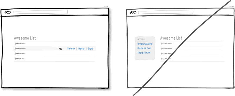
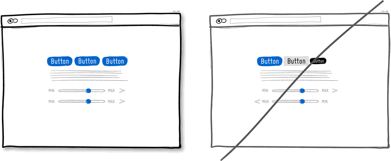
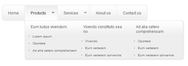
    Over the course of time, it's easy to unintentionally create multiple sections, elements and features which all perform the same function. It's basic entropy - things start falling apart over time. Keep an eye out for duplicate functionality labelled in various ways, as it puts a strain on your customers. Often, the more UI fragmentation there is, the higher the learning curve which your customers will have to deal with. Consider refactoring your UI once in a while by merging similar functions together.
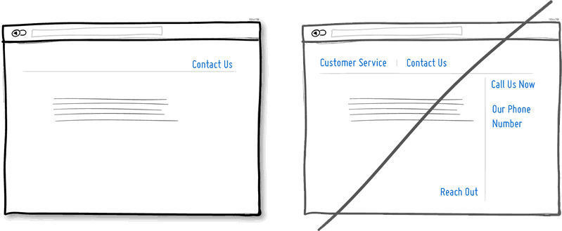
  4. Try Social Proof instead of talking about yourself.
     Social proof is another great persuasion tactic directly applicable to increasing conversion rates. Seeing that others are endorsing you and talking about your offering, can be a great way to reinforce a call to action. Try a testimonial or showing data which proves that others are present.
  5. Try Repeating Your Primary Action instead of showing it just once.
    Repeating your call to action is a strategy that is more applicable to longer pages, or repeating across numerous pages. Surely you don't want to have your offer displayed 10 times all on the same screen and frustrate people. However, long pages are becoming the norm and the idea of squeezing everything "above the fold" is fading. It doesn't hurt to have one soft actionable item at the top, and another prominent one at the bottom. When people reach the bottom, they pause and think what to do next - a potential solid place to make an offer or close a deal.
  6. Try Distinct Styles Between Clickable And Selected Items instead of blurring them.
    Visual styling such as color, depth, and contrast may be used as a reliable cue to help people understand the fundamental language of navigating your interface: where am I, and where can I go. In order to communicate this clearly to your users, the styles of your clickable actions (links, buttons), selected elements (chosen items), and plain text should be clearly distinct from one another and then applied consistently across an interface. In the visual example, I've chosen a blue color to suggest anything that can be clicked on, and black as anything that has been selected or indicates where someone is. When applied properly, people will more easily learn and use these cues to navigate your interface. Don't make it harder for people by blurring these three functional styles.
  7. Try Recommending instead of showing equal choices.
     When showing multiple offers, then an emphasized product suggestion might be a good idea as some people need a little nudge. I believe there are some psychology studies out there which suggest that the more choice there is, then the lower the chances of a decision actually being made and acted upon. In order to combat such analysis paralysis, try emphasizing and highlighting certain options above others.
  8. Try Undos instead of prompting for confirmation.
     Imagine that you just pressed an action button or link. Undos respect the initial human intent by allowing the action to happen smoothly first and foremost. Prompts on the other hand suggest to the user that he or she does not know what they are doing by questioning their intent at all times. I would assume that most of the time human actions are intended and only in small situations are they accidental. The inefficiency and ugliness of prompts is visible when users have to perform actions repeatedly and are prompted numerously over and over - a dehumanizing experience. Consider making your users feel more in control by enabling the ability to undo actions and not asking for confirmation where possible.
  9. Try Telling Who It's For instead of targeting everyone.
     Are you targeting everyone or are you precise with your audience? This is a conversion idea where you could be explicit about who exactly your product or service is intended for. By communicating the qualifying criteria of your customers, you might be able to actually connect more with them while at the same time hinting at a feeling of exclusivity. The risk with this strategy of course is that you might be cutting yourself short and restricting potential customers. Then again, transparency builds trust. 
    (Side note: Enjoying the little characters style? Please be sure to check out MicroPersonas.)
  10. Try Being Direct instead of indecisive.
     You can send your message with uncertainty trembling in your voice, or you can say it with confidence. If you're ending your messaging with question marks, using terms such as "perhaps", "maybe", "interested?" and "want to?", then most likely you have some opportunity to be a bit more authoritative. Who knows, maybe there is a bit more room for telling people what to do next in the world of conversion optimization.
  11. Try More Contrast instead of similarity.
     Making your calls to action be a bit more prominent and distinguishable in relation to the elements surrounding them, will make your UI stronger. You can easily increase the contrast of your primary calls to action in a number of ways. Using tone, you can make certain elements appear darker vs. lighter. With depth, you can make an item appear closer while the rest of the content looks like it's further (talking drop shadows and gradients here). Finally, you can also pick complementary colors from the color wheel (ex: yellow and violet) to raise contrast even further. Taken together, a higher contrast between your call to action and the rest of the page should be considered.
  12. Try Showing Where It's Made instead of being generic.
    Indicating where you, your product or service is from says quite a bit subliminally while at the same time moves your communication to a more personal level. Mentioning the country, state or city of origin is surely a very human like way to introduce oneself. If you can do the same virtually then you just might be perceived as a bit more friendly. Often, stating where your product is being made at also has a pretty good chance of making it feel of slightly higher quality. It's a win win.
  13. Try Fewer Form Fields instead of asking for too many.
     Human beings are inherently resistant to labor intensive tasks and this same idea also applies to filling out form fields. Each field you ask for runs the risk of making your visitors turn around and give up. Not everyone types at the same speed, while typing on mobile devices is still a chore in general. Question if each field is really necessary and remove as many fields as possible. If you really have numerous optional fields, then also consider moving them after form submission on a separate page or state. It's so easy to bloat up your forms, yet fewer fields will convert better.
  14. Try Exposing Options instead of hiding them.
     Each pull down menu that you use, hides a set of actions within which require effort to be discovered. If those hidden options are central along the path to getting things done by your visitors, then you might wish to consider surfacing them a bit more up front. Try to reserve pull down menus for options that are predictable and don’t require new learning as in sets of date and time references (ex: calendars) or geographic sets. Occasionally pull down menu items can also work for those interfaces that are highly recurring in terms of use - actions that a person will use repeatedly over time (ex: action menus). Be careful of using drop downs for primary items that are on your path to conversion. 
  15. Try Suggesting Continuity instead of false bottoms.
     A false bottom is a conversion killer. Yes, scrolling long pages are great, but be careful of giving your visitors a sense that the page has come to an end somewhere in between sections where it really hasn't. If your pages will scroll, try to establish a visual pattern or rhythm that the user can learn and rely on to read further down. Secondarily, be careful of big gaps in around the areas of where the fold can appear (of course I’m referring to a area range here with so many device sizes out there).
  16. Try Keeping Focus instead of drowning with links.
     It’s easy to create a page with lots of links going left and right in the hope of meeting as many customer needs as possible. If however you’re creating a narrative page which is building on towards a specific call to action at the bottom, then think twice. Be aware that any link above the primary CTA runs the risk of taking your customers away from what you’ve been hoping them to do. Keep an eye out on the number of links on your pages and possibly balance discovery style pages (a bit heavier on the links) with tunnel style pages (with fewer links and higher conversions). Removing extraneous links can be a sure way to increase someone’s chances of reaching that important button.
  17. Try Showing State instead of being state agnostic.
     In any user interface we quite often show elements which can have different states. Emails can be read or unread, invoices can be paid or not, etc. Informing users about the particular state in which an item is in, is a good way of providing feedback. Interface states can help people understand whether or not their past actions have been successfully carried out, as well as whether an action should be taken.
  18. Try Benefit Buttons instead of just task based ones.
     Imagine two simple buttons displayed on a page. One button tells you that it will “Save You Money”, while the other one asks you to “Sign Up”. I’d place my bets that the first one might have a higher chance of being acted on, as a sign up on it’s own has no inherent value. Instead, a sign up process takes effort and is often associated with lengthy forms of some sort. The hypothesis set here is that buttons which reinforce a benefit might lead to higher conversions. Alternatively, the benefit can also be placed closely to where the action button is in order to remind people why they are about to take that action. Surely, there is still room for task based actions buttons, but those can be reserved for interface areas that require less convincing and are more recurring in use.
  19. Try Direct Manipulation instead of contextless menus.
    Occasionally it makes sense to allow certain UI elements to be acted upon directly as opposed to listing unassociated generic actions. When displaying lists of data for example, we typically want to allow the user to do something with the items in the list. Clicking on, or hovering over an item in this list can be used to express that a particular item is to be manipulated (deleted, renamed, etc.). Another example of common direct manipulation would be clicking on a data item (say a text based address) which then turns into an editable field. Enabling such interactions cuts through the number of required steps, compared to if the same task was started more generally without the context of the item - since selection is already taken care of. Do keep in mind of course that for generic item-agnostic actions, there is nothing wrong with contextless menus.
  20. Try Exposing Fields instead of creating extra pages.
     When creating landing pages that convey value, it can be beneficial to show the actual form fields on the conversion page itself. Merging the sign up form with the landing page comes with a number of benefits in comparison to creating separate multi-page sign ups. First, we are cutting out extra steps from the flow in general and the task at hand takes less time. Secondly, by showing the number of form fields right there, we are also providing the customer with a sense of how long the sign up actually is. This of course is a little easier when our forms are shorter in the first place (which of course they should be if possible).
  21. Try Transitions instead of showing changes instantly.
     Interface elements often appear, hide, move, shift, and resize as users do their thing. As elements respond to our interactions, it sometimes is a little easier to comprehend what just happened when we sprinkle in the element of time. A built in intentional delay in the form of an animation or transition, respects cognition and gives people the required time to understand a change in size or position. Keep in mind of course that as we start increasing the duration of such transitions beyond 0.5 seconds, there will be situations where people might start feeling the pain. For those who just wish to get things done quickly, too long of a delay of course can be a burden.
  22. Try Gradual Engagement instead of a hasty sign up.
     Instead of asking visitors to sign up immediately, why not ask them to first perform a task through which something of value is demonstrated. During such initial interactions the product can both show off its benefits, as well as can lend itself to personalization. Once users begin to see your product’s value and see how they can make it their own, they will then be more open to sharing with you additional information. Gradual engagement is really a way to postpone the sign up process as much as possible and still allow users to use and customize your application or product.
  23. Try Fewer Borders instead of wasting attention.
     A Good User Interface
    has high conversion rates and is easy to use. In other words, it's nice to both the business side as well as the people using it. Here is a running list of practical ideas to try out. You've read all tips.Borders compete for attention with real content. Attention of course is a precious resource since we can only grasp so much at any given time. Surely borders can be used to define a space very clearly and precisely, but they also do cost us cognitive energy as they are perceived as explicit lines. In order to define relationships between screen elements which use less attention, elements can also be just grouped together through proximity, be aligned, have distinct backgrounds, or even just share a similar typographic style. When working in abstract UI tools, it’s easy to drop a bunch of boxes everywhere. Boxes however come with a false sense of being immune from the order and unity which governs the rest of the screen. Hence pages with lots of boxes sometimes may tend to look noisy or misaligned. Sometimes it is helpful to throw in a line here and there, but do consider alternative ways of defining visual relationships that are less taxing to attention and your content will come through.
  24. Try Selling Benefits instead of features.
     I think this is Marketing 101. People tend to care less about features than they do about benefits. Benefits carry with them more clearly defined value. Chris Guillebeau in "The $100 Startup" writes that people really care about having more of: Love, Money, Acceptance and Free Time, while at the same time wishing for less Stress, Conflict, Hassle and Uncertainty. When showing features, and I do believe that there is still room for them occasionally, be sure to tie them back to benefits where possible.
  25. Try Designing For Zero Data instead of just data heavy cases.
    There are cases when you will have 0, 1, 10, 100, or 10,000+ data results which might need to be displayed somehow in various ways. The most common of these scenarios is probably the transition from first time use with zero data towards future use with a lot more data. We often forget to design for this initial case when there is still nothing to display whatsoever, and by doing so we run the risk of neglecting users. A zero data world is a cold place. When first time users look at your app and all it does is show a blank slate without any guidance then you’re probably missing out on an opportunity. Zero data states are perfect candidates for getting users across the initial hurdle of learning by showing them what to do next. Good things scale and user interfaces are no exception.
  26. Try Opt-Out instead of opt-in.
     An opt-out strategy implies that users or customers are defaulted to take part in something without having to take any action. Alternatively, there is also the more traditional opt-in strategy that requires people to first take an action in order to take part in or receive something. There are two good reasons why opt-out works better than opt-in. First it alleviates resistance on the path of action, as the user does not have to do anything. Secondly, it’s also a form of recommendation which implies some kind of a norm - “since everyone else takes this as it is, I might also do the same”. Of course the opt-out strategy is often perceived as controversial as there are those sleazy marketers which will abuse it. One such evil is to diminish the readability of the opt-out text, while another is to use confusing text, such as double negatives. Both examples will result in users being less aware of actually signing up for something. Hence to keep the ethics in check, if you do decide to go with an opt-out approach, do make it very clear and understandable to your customers what they are being defaulted into. After all, this tactic has also been used in Europe to save lives.
  27.  

Try Consistency instead of making people relearn.

 Striving for consistency in user interface design is probably one of the most well known principles since Donald Norman’s awesome books. Having a more consistent UI or interaction is simply a great way to decrease the amount of learning someone has to go through as they use an interface or product. As we press buttons and shift sliders, we learn to expect these interaction elements to look, behave and be found in the same way repeatedly. Consistency solidifies the way we learn to interact and as soon as it is taken away, we are then forced back into learning mode all over again. Consistent interfaces can be achieved through a wide possible range of things such as: colors, directions, behaviors, positioning, size, shape, labelling and language. Before we make everything consistent however, please let’s bear in mind that keeping things inconsistent still has value. Inconsistent elements or behaviors come out into attention from the depths of our habitual subconscious - which can be a good thing when you want to have things get noticed. Try it, but know when to break it.Try Smart Defaults instead of asking to do extra work.

 Using smart defaults or pre-filling form fields with educated guesses removes the amount of work users have to do. This is a common technique for helping users move through forms faster by being respectful of their limited time. One of the worst things from an experience and conversion stand point is to ask people for data that they have already provided in the past, repeatedly over and over again. Try to display fields that are preloaded with values to be validated as opposed to asking for values to be retyped each time. The less work, the better.Try Conventions instead of reinventing the wheel.

 Convention is the big brother of consistency. If we keep things similar across an interface, people won’t have to obviously struggle as hard. If on the other hand, we all keep things as similar as possible across multiple interfaces, that decreases the learning curve even further. With the help of established UI conventions we learn to close screen windows in the upper right hand corner (more often than not), or expect a certain look from our settings icons. Of course there will be times when a convention no longer serves purpose and gives way to a newer pattern. When breaking away, do make sure it’s purposefully thought out and with good intention.Try Loss Aversion instead of emphasizing gains.

 We like to win, but we hate to lose. According to the rules of persuasive psychology, we are more likely to prefer avoiding losses than to acquiring gains. This can be applied to how product offerings are framed and communicated. By underling that a product is protective of a customer’s existing well-being, wealth or social status, such strategy might be more effective than trying to provide a customer with something additional which they don’t already have. Do insurance companies sell the payout that can be gained after the accident or the protection of the things we hold dear to us?


Источник: http://goodui.org

Аватар пользователя Натали

Список недоделок модуля Advanced Forum

Раздел: 

Всем известный и один из самых распространенных форумой на CMS Drupal используется уже давно и работает отлично. Но при настройке форума постоянно приходится править некоторые мелочи, которые часто забирают кучу времени. Наша команда решила собрать эти мелочи в список, расшифровав где и как их поправить, чтобы можно было сделать необходимые правки по быстрому.

  1. ИМЯ САЙТА/forum/ТЕМА ФОРУМА - необходиом перевести слова TOPIC / TOPIC STARTER - чтобы это написать необходимо в поиске переводов написать маленькими буквами слово "starter", большими буквами и все вместе не находит Переводится это дело как Тема / Автор темы.
  2. Кнопка "Вверху" нужно поменять на слово "Вверх" - ищем в поиске переводой слово "Top" именно с большой буквы или "Вверху" тоже с большой буквы
  3. Для кнопок форума поправить цсс, чтобы кнопки не прилипали к табличке форума
  4. by Admin » ср, 09/11/2013 - 13:22 – для этой надписи слово “by” необходимо перевести или убрать его, оставив только имя автора - переводится в переводе интерфейса (Конфигурация - Перевод интерфейса - Перевести), чтобы найти все необходимое нужно в поиске переводов сделать вот такие запросы: <br /> by [name_1] и by [last_comment_name] - при переводе можно заменить слово "by" на что-то другое, а можно просто скопировать код с английского варианта и убрать слово "by"
  5. Перевести Currently active users: 1 - Активных пользователей: 1 - переводится в переводе интерфейса (Конфигурация - Перевод интерфейса - Перевести)
  6. Active topics - для поиска в переводах писать именно с большой буквы - Активные темы
  7. Unanswered topics - тоже с поиске с большой буквы - Неотвеченные темы
  8. New & updated topics - тоже искать именно с большой буквы - Новые и обновленные темы

Постепенно по ходу работы список будет дополняться. Спасибо за помощь в сооружении списка одному из наших клиентов, Александру )

Аватар пользователя Натали

Создание блока программно

Раздел: 

Для создания блока в drupal 7 необходимо использовать два Хука

MYMODULENAME_block_info() // для объявления дескриптора блока
MYMODULENAME_block_view() // для генерации контента блока
если необходимо в стандартную конфигурационную форму блока добавить дополнительные поля то используются следующие хуки

MYMODULENAME_block_configure() // для объявления дополнительных элементов формы конфигурации блока
MYMODULENAME_block_save() // для дополнительных действий по сохранению данных из дополнительных элементов формы
теперь остановимся подробно о создании блока

/**
* Реализация hook_block_info().
*/
function demo_block_info() {
$blocks['demo'] = array(
'info' => 'Первый блок, который вы создали самостоятельно ',
);

return $blocks;
}

  • 'demo' - дельта (машинное имя) блока, служит для того чтобы отличать блоки друг от друга в процессе, рекомендуется чтобы дельта начиналась с имени модуля который объявляет блок

Хук возвращает ассоциированный массив дескрипторов блоков c cледующими ключами

  • info: (обязательно) - "Человеческое" имя блока для страницы администрирования блоков в админ части сайта
  • cache: определяет вид кеширования блока
    • DRUPAL_CACHE_PER_ROLE (default) по ролям пользователя
    • DRUPAL_CACHE_PER_USER: по пользователям.
    • DRUPAL_CACHE_PER_PAGE: по странично
    • DRUPAL_CACHE_GLOBAL: глобально в пределах сайта
    • DRUPAL_CACHE_CUSTOM: Модули самостоятельно определяют механизм кеширования.
    • DRUPAL_NO_CACHE: Не кешировать.
  • properties:Дополнительные метаданные блока
    • administrative:Логический флаг опредяющий что блок используется в административной части сайта
  • weight: Вес блока
  • status: Состояние блока. (1 = включен, 0 = выключен)
  • region: Первоначальный регион в котором показывается блок
  • visibility: Видимость блока
    • BLOCK_VISIBILITY_NOTLISTED: Показывать на всех страницах кроме перечисленных
    • BLOCK_VISIBILITY_LISTED: Не показывать на всех страницах кроме перечисленных
    • BLOCK_VISIBILITY_PHP: определяется PHP кодом ( не рекомендуется использовать)
  • pages: Если visibility BLOCK_VISIBILITY_NOTLISTED или BLOCK_VISIBILITY_LISTED стока путей разделенная '\n', '\r', или '\r\n' , или PHP код если 'visibility' = BLOCK_VISIBILITY_PHP. Пути могут включать '*' '' . Для BLOCK_VISIBILITY_PHP, если PHP код возвращает TRUE блок будет показан, если FALSE блок будет скрыт.

Рекомендуется вместо visibility BLOCK_VISIBILITY_PHP использовать хук

MYMODULE_block_list_alter()
в нем необходимо по условиям делать unset блокам согласно дельты и дополнительных условий удаление контента блока или unset на более поздних этапах приводит к дополнительной нагрузке на CPU и может привести к падению производительности сайта.

генерация контента блока (желательно использовать Render API для генерации контента блока)

/**
* Реализация hook_block_view().
*/
function demo_block_view($delta = '') {
switch ($delta):
case 'demo':
$block['subject'] = 'Пример'; // - заголовок блока во фронтенде.
$block['content'] =
'Содержимое переменной Текст: '.
variable_get('demo_text', '');
break;
endswitch;
return $block;
}

блок конфигурации блока, Любой блок имеет собственную стандартную форму конфигурации в которую можно добавить дополнительные поля как обычно в Form API

/**
* Реализация hook_block_configure().
*/
function demo_block_configure($delta = '') {
$form = array();

switch ($delta):
case 'demo':
$block = block_load('demo', 'demo');
$form['demo_text'] = array(
'#type' => 'textfield',
'#title' => 'Текст',
'#description' => 'Впишите сюда одну строчку любого текста.',
'#default_value' => variable_get('demo_text', '')
);
/*
Здесь могут располагаться различные элементы формы:
вкладки, кнопки, радиокнопки, списки и т.п.
*/
break;
endswitch;

return $form;
}

хук сохранения данных из формы конфигурации блока (эквивалентен Hook_form_submit() в Form API) $edit - данные которые пользователь ввел в форме

/**
* Реализация hook_block_save().
*/
function demo_block_save($delta = '', $edit = array()) {
switch ($delta):
case 'demo':
variable_set('demo_text', $edit['demo_text']);
break;
endswitch;
}

Injoy!

Аватар пользователя Натали

Работа с гитом: схема

Раздел: 

Аватар пользователя Натали

Соцкнопки

Раздел: 

Для соцкнопок существует множество различных модулей, которые разработаны под Друпал, но в каждом их них чего-то не хватает.
Один из самых распростаненных - это  ShareThis (http://sharethis.com/#sthash.alMRPPqO.dpbs)

В этом модуле нету Мой мир, но зато он очень удобно сделан для настройки. Все в графическом виде и можно сразу видеть какие кнопки получим в результате.

Аватар пользователя Натали

Настройка изображений при помощи Imagechashe

Сделать картинки одинаковые по ширине и разные по высоте

Для того, чтобы сделать данную задачу, стандартного имедж кеша не хватит. Для выполнения задуманного, а именно выстраивания картинок одинаковыми по ширине и разными по высоте, необходимо поставить дополнения к модулю Imagechashe.

Эти дополнения можно поставить по вот этой ссылке - http://drupal.org/project/imagecache_actions

После установки дополнения, в Конфигурация - Стили изображения - Добавить стиль - необходимо добавить такой сценарий - Custom action - и в нем прописать следующий код:

$pct = 200/$image->info['width'];

image_gd_resize($image,$image->info['width']*$pct,$image->info['height']*$pct);
return TRUE;
 
В нашем случае все картинки стали по ширине 200px, а по высоте в пропорциях остаются нефиксированнного размера.


Прицепить к картинке под низ тень или фоновое изображение в виде рамки


========================================
Возможно, пригодятся следующие ссылки:


Аватар пользователя Натали

Как разместить баннер в Друпале

В Drupal готовые баннеры разместить достаточно несложно, это может сделать не только опытный разработчик, но и сам клиент, приложив немного усилий, прочитав данную инструкцию:
Разместить баннер:
1. Заходим Структура - Блоки - Добавить блок
2. Описание блока - обязательно вписывать название понятное для себя, что это будет за блок.
3. Заголовок блока - 1) Можно не писать ничего, тогда сам сайт выведет машинное имя - это часто неудобно 2) Можно писать свое название, например такое же как и в описании 3) Если не нужен заголовок вообще, то вписываем в строку <none>
4. В поле Содержимое блока есть зеленая кнопка Изображение - Выбор на сервере - Закачать - Обзор... - Выбираем картинку с баннер - нажимаем на саму картинку - ширина картинки доолжна быть например 700-750 - ОК
5. В поле bigportal.biz выбираем в выпадающем списке в какой части сайта разместить баннер.
6. Выбираем внизу на каких страницах размещать баннер.
7. Внизу кнопка Сохранить.
8. Чтобы поменятьместами блоки - Структура - Блоки - находим наш блок по названию и перетаскиваем за крестик меняя местами. В самом низу нажимаем Сохранить.
Всем удачи!

Аватар пользователя Натали

Баннеры, слайдшоу, галлереи - что чем называется.

Баннеры часто позволяют увеличить объемыпродаж, привлечь внимание клиентов и покупателей, дают коротко и четко важную информацию.

Итак, как от клиентов, так и от разработчиков часто возникают непонятки, что такое баннер, а что такое слайдшоу, каким оно может быть и что делать нужно и стоит, а что не стоит делать вообще. Наша студия по разработке сайтов  "Большой Хамелеон" решила создать статью, которая поможет разобраться во всем этом, надеемся благодаря этой статье общение между клиентом и разработчиков немного упростится :) Всем удачного прочтения.

Итак, что и как называется.

Баннер - это обязательно реклама на что-либо. Направление рекламы может быть следующей:

1. На внутренние страницы, разделы на сайте. ИЛИ 2. На страницы, ведущие на другие сайты

Пример:

Для пункта 1 - На внутренние страницы, разделы на сайте: реклама о том, что товары определенной серии мебели продаются со скидкой - при этой кликая на картинку с такой рекламой мы попадаем на раздел с этой серией.

Для пункта 2 - 2. На страницы, ведущие на другие сайты: реклама, которую подключают к своему сайту, она ведет на другой сайт похожей тематики, при этой хозяин сайта получает небольшие сумммы за клики на баннеры посетителями сайта.

3. Кликабельная реклама - на которую нажимаем и попадаем на определенную страницу. ИЛИ 4. Некликабельная реклама - просто несущая информацию в картинке.

Пример:

Для пункта 3 - Кликабельная реклама: реклама на то, что если покупатель купит товар на определенную сумму, он бонусом получит нетбук, при этом можно нажать на баннер и попасть на страницу, на которой есть описание о том, какую серию мебели и на какую сумму нужно купить, чтобы получить в подарок нетбук.

Для пункта 4 - Некликабельная реклама:  реклама на то, что в магазине вообще проводится скидка на товары в этом месяце, при этом на баннер нельзя нажать и прочитать дополнительную информацию, баннер сам по себе несет информацию и остается некликабельным, никаких действий с ним нельзя прорводить, прочитал и все.


Аватар пользователя Натали

Менюшки для Друпала

Раздел: 

Мега менюшки (Multi Column Menus navigation) то веб навигационные меню, которые содержат множество настраеваемых элементов (таких как текст, картинки, видео, слайдшоу...). Достаточно просто можно создать или найти мега менюшки, реализованные при помощи CSS и JavaScript, но для данной цели в Друпале есть уже специально разработанные модули. Ниже приведены некоторые из таких модулей:


OM Maximenu

(первое - ниже)


(второе - ниже)

"Увеличьте возможность основной навигации, добавив текст, картинки, видео, слайдшоу, табы, блоки менб, информацию о пользователе..."

Модуль OM Maximenu дает все эти возможности, он создает меню с другими модульными блоками, которые вам необходимы, как вложения (attachments), модули типа вьюс (views), слайдшоу, меню, пользователя, меню типа nice menus, табы типа quicktabs, пользовательские блоки с таблицами, списки, картинки, видео и т.д.


Megamenu

(третье - ниже)


Этот модуль позволяет построить мега меню при помощи jQuery и существующей системы меню в Drupal. Мегаменю берет менюшку Друпала, которая имеет три уровня вложенности, и конвертирует ее в конвертирует ее в трехуровневое мега выпадающее меню, которое будет вставлено в вашу тему как блок.


Superfish

jQuery Superfish меню плагин интегрированный с Drupal менюшками. Этот модуль поддерживает мультиколончатое субменю такое как мега меню.

(четвертое - ниже)

(пятое - ниже)


Menu Views (только для Друпал 7)

(шестое - ниже)


Вьюс меню (Menu Views) позволяем разработчику внедрить вьюс внутрь пункта меню (menu item).

Это меню будет полезно тогда, когда необходимо создать мега меню со следующим контентом:

  • Текущий блок, нода или пост пользователя
  • Комплексные представления (Complex views), которые содержат картинки и различный HTML код.

MuchoMenu

(седьмое - ниже)

(восьмое - ниже)

Этот модуль позволяет пользователям создавать мега менюшки, которые имеют мини панели как всплывающий контент. Преимуществом является то, что в данное меню сожно добавить любой тип контента или или пользовательский интерфейс.

Giga Menu

Модуль Giga Menu позволяет сделать так, чтобы обычное меню отображалось как мега меню.

Menu Minipanels

Существует огромное количество настроек, доступных через минипанели и почти все они могут быть добавлены к одному из следующего - представлений (views), слоков (blocks), нод (nodes), других менбшек, и даже к сырому PHP коду если включен PHP фильтр. Каждая минипанель можетт быть настроена по разному и надо быть очень внимательными, сможете ли вы их добавить в меню.

Mega Dropdown (sandbox)

Mega Dropdown module allows Drupal websites to display a menu a Mega Menu. It actually takes the concepts of the several other Mega Menus (also called Super Menus) such as Mega Menu, Giga Menu andMenu Minipanels, a step further. This module allows embedding of a Block, View, Node, or sub-menu items, on the menu. This enables placing, sub-menu content, images, text and even forms, on the menu system.

What modules do you like? Do you want new themes come with mega menu?


=========================================

Есть еще менющки, которые делаются при помощи цсс3, ои пока еще могут не везде работать, но получается очень красиво.

http://habrahabr.ru/post/131558/

http://seoromin.com.ua/topic/144_kak-sozdat-flesh-menyu-s-pomoschyu-css/

Аватар пользователя Натали

Список ссылок для обучения разработчикам

Обучающие сайты по Друпалу:

http://drupal.zvirec.com/ - хороший сайт для начинающий разработчиков, хотя и для тех, кто уже работает неплохой.

http://sixrevisions.com/web-development/getting-started-with-drupal-a-co... - создание меню и материалов


http://www.cmsmagazine.ru/library/items/cms/drupal_intro/ - вводный курс по друпалу

http://drupalace.ru/uroki - о шаблонах

на англ - http://site-made.ru/book/export/html/6 - начиная работу - на английском

на русс - http://www.drupal.ru/quickstart  - начиная работу - на русском


http://habrahabr.ru/blogs/drupal/64286/ - оптимизация сайтов


http://drupalace.ru/uroki - набор уроков


http://drupalize.me/ - очень полезный сайт как для теммизаторов, так и разработчиков, но на английском.